
Bitte kein Aprostroph und Leerzeichen bei "Schwierigkeitsgrad", ansonsten ziemlich geil


Bitte kein Aprostroph und Leerzeichen bei "Schwierigkeitsgrad", ansonsten ziemlich geil

oki doki loki

Mal 'n bisschen Dialogaction. ;0

--
etwa etwas finde ich etwas..ähm...schwierig. Schreib das doch um.
Ansonsten aber echt schöne, solide Screenshots. Nette Textbox.
--Du hattest schon x Chancen bekommen, die du nie genutzt hast. Man hat so oft versucht dir zu helfen und dennoch ignorierst du alles! Anstatt dass du hörst, was man dir sagt, pisst du den Leuten lieber weiter ans Bein! Du bist hier im Forum nicht mehr erwünscht! Jeder neue Account von dir wird von uns gebannt werden! ~ Knuckles

Empfinde ich auch so. Vllt "...Wollen die Herren mir was vorgaukeln? oder Wollen die Herren mir etwa was vorgaukeln..." würde besser passen.Zitat von Nonsense

Im zweiten Dialog würde ich vor Zivilisation ein Artikel oder so mit einbeziehen. "Aber wenn ich erstmal wieder die Zivilisation erreicht habe ..."

@Everyone who commented - Thank you for the kind words. I will consider your advice
Those trees on the side were a bitch to make.
Edit - This always happens, it looks fine until I post it and find an error on the right.
--
--"Gib einem Mann Feuer, und er hat es einen Tag lang warm. Steck ihn in Brand, und er hat es warm für den Rest seines Lebens"

Mass Effect? xD

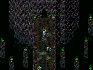
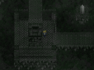
Da ich das TA/Velsarbor-Forum erstmal dichtgemacht habe, gibt's Screenies zu TA mal hier. Mit dabei die Klassiker: Standard-Chipsets, Nichts-Aussagbarkeit und dumme Sprüche. Oh Mann, Sandoria ist ein Monster geworden. Ich hasse Zentes. Heutiges Motto: Im Dunkeln lässt sich gut munkeln.
Abbau von Kupfersulfatüberschüssen.
Scheiß Aussicht!
Hey! Wer hat das Licht ausgemacht?
--
Oh? Niemand sagt „zu dunkel” oder „zu leer”? Na dann wird halt etwas noch dunkleres und leereres hinterhergeschmissen, so richtig schön mit bewegtem Paralax, Nebel- und Grieseleffekten, die man auf dem Bild alle mal so richtig gut nicht erkennen kann.
--

http://www.rpg-atelier.net/tara/Licht%20aus.png
Die Steinplatten würd ich beim Übergang von Schmutz bedecken lassen, also so dass der Dreck etwas in die Platten reinragt.
Rest schaut gut aus.
you mean the cut off tree top?
Map looks fine to me, nothing to criticize.
--Elektra Kingdom v.4.12 Demo 5 in der Mache *click
Offizieller Blog zum Spiel News, Links, Screenshots, etc. *click
Tanalin Integer Scaler Fullscreen Tool für RPG Maker 2000 / 2003 Spiele *click
VirtualMIDISynth Fix für kaputte MIDI Musik *click
Windows Photo Viewer Fix für unscharfe Windows Fotoanzeige *click
RPG Maker 2000 / 2003 (Steam) Korrektes Vollbild , Performance+ & Ultimate *click
@GSandSDS: Die Screens sind leider etwas unspektakulär zumal man auch schon genügend Höhlen aus TA kennt >_> Aber s****ß drauf es ist TA! Du hättest genau so gut einen komplett schwarzen Screen aus einer der Albtraumsequenzen von Tara zeigen können und ich würd mich freuen \o/ Beim nächsten mal aber vielleicht doch lieber wieder ein Trailer bei dem man auch n bisschen was neues von Gameplay sieht? Imo war das immer die Stärke des Spiels...
@Maister-Räbbit: Die Sonne sieht irgendwie zu "paintig" aus. Ansonsten recht schick ^_-
@Tau: I like your natural shaped map design. But maybe you should use the ground textures a little bit more.
Gruß
Stoep
@Stoep:
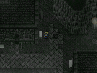
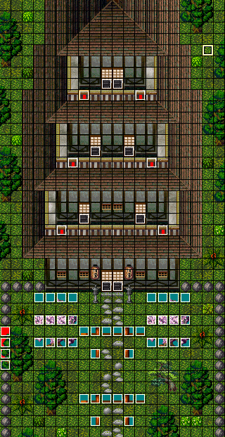
Ach, wenn es völlig egal ist, was ich zu TA zeigen, dann magst du ja vielleicht auch das hier (zugegeben, das geht nur noch schwer als Screenshot durch, aber hey, es ist ein Screenshot-Ausschnitt direkt aus dem Arbeitsbereich des Makers). Aktuelles Bild betont nicht schwarz. Und es ist ein … äh … Haus (siehe Topic).
Was ist ein Asia-Kontinent ohne Pagode? (work in progress)
--
Sieht man die auch im Spiel komplett? Ansonsten bräuchte es nur die Stellen bis zur Sichtgrenze.
--Elektra Kingdom v.4.12 Demo 5 in der Mache *click
Offizieller Blog zum Spiel News, Links, Screenshots, etc. *click
Tanalin Integer Scaler Fullscreen Tool für RPG Maker 2000 / 2003 Spiele *click
VirtualMIDISynth Fix für kaputte MIDI Musik *click
Windows Photo Viewer Fix für unscharfe Windows Fotoanzeige *click
RPG Maker 2000 / 2003 (Steam) Korrektes Vollbild , Performance+ & Ultimate *click
Nicht in einem Stück komplett, aber jeden Teil. Die Balkone können betreten werden, so sieht man jedes Stockwerk von ihr (inklusive der Ansätze für die Stockwerke darüber und darunter). Eventuell gibt es zudem noch beim ersten Betreten der Map eine kurze Kamerafahrt (wie man sie bei jedem ersten Betreten einer Stadt auch kennt).
--
@Maister-Räbbit:
Oh, ich sehe da ein kosmisches Drama auf die Leute in dem Sonnensystem zukommen. Ein Planet wird zerstört und von der Sonne verschlungen. Damit verschiebt sich potentiell das gravitative Gleichgewicht der anderen Planeten. Sie könnten ihre Bahnen ändern und damit ggf. unbewohnbar werden. Oder nach so viel hundert oder tausend umläufen kegelt es einen Planeten vielleicht ganz aus dem System. Drama halt.
Kleiner Nachtrag: Ich finde, dass die Planeten allgemein sehr gut zueinander passen. Nur die Sonne könnte etwas mehr himmelskörperartiger aussehen. So wie viele Bilder halt, wenn man bei Google in der Bildersuche mal "Sonne" eingibt.
--
irgendwie passen die planeten nicht zueinander.
die sonne sind einfach nur komische kreise, der ganz linke planet ist sehr weich gezeichnet, wärend der ganz rechts unten extrem grobkörnig ist.
dazu sieht der blaue planet oben auch komplett anders aus. der blaue planet unten passt sich wiederrum imo etwas besser an den rest an (wobei ich auch hier das blau ein wenig anpassen würde, und vll auch mehrere stufen).
irgendwie ein ziemlicher mischmasch. den hintergrund finde ich aber gut^^
@Tau: Wow i like it! Did you use a mix between SD3 and Terranigma or something like that?
@Maister-Räbbit: In Anbetracht der Spiele, die du sonst so verzapfst, macht mich der Screenshot mehr als neugierig. Ich hätte längst mal Bock auf eine anständige Space-Sim, wenn es sich denn bei dir um eine handelt. Während mich das Meiste, das kritisiert wurde gar nicht so stört, finde ich hingegen den Cursor sehr austauschwürdig, der erinnert so an Win98!Hau' mal ein paar Infos zum Projekt raus!
@GSandSDS: Wow, cool dass Tara noch immer weiterentwickelt wird. Sieht alles solide aus, der letzte Screen gefällt mir sehr.
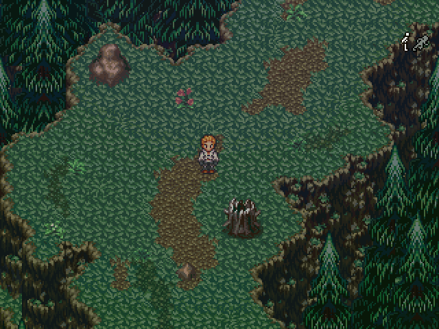
@Eiskender - It is a mix of Terranigma and SD3 but I didn't mix it. I'll post the tile if you want it?
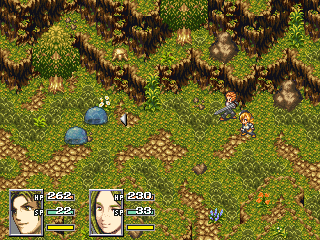
@Stoep - Thank you, it does seem empty right now, but there will be touch encounters so the wide space allows you to avoid the confrontation when it's placed in.
@Davy Jones - Thanks
@GSandsDS - I honestly don't see much room for improvement on that tower map, looks perfect just the way it is. Only thing missing I guess is people?
Battle(WIP) faces will probably change.
--
@Tau Okay gurl that looks FAN-CY :3
i realy like the sprites especially the Monster sprites look realy well
but there is one thing i don´t think it looks all to good that the sword is covering his entire sprite there
maybe you should try out a differnt pose for him ?
 Berechtigungen

 Support me On my